Simplifying Knowledge Discovery for 100+ Researchers
Redesigning Adobe's Research Ops Wiki for clarity, scale, and discoverability.
My Role:
Research Ops Intern
Timeline:
May - Aug 2025
Skills:
UX Research & Testing, Information Architecture, UX Content Strategy, Stakeholder Communication, Usability Testing, Data Analysis
Tools:
Sketch, Figma, Confluence, UserTesting, Qualtrics, Maze, Miro
The Business Problem
Here's the thing about internal wikis: they're built with the best intentions, but over time they become these sprawling labyrinths where knowledge goes to hide.
The ADRS wiki serves100+ researchers across Adobe's design organization, but it had become a significant productivity bottleneck. The business impact was tangible:


The underlying issue?
The wiki had grown organically over 5+ years without a coherent structure. What started as a simple knowledge repository had evolved into a complex maze with inconsistent categorization, buried resources, and navigation that required institutional knowledge to decode.
My challenge:
How might I redesign the information architecture and content strategy to make the wiki scalable, intuitive, and actually useful—without disrupting active workflows or requiring a complete system overhaul?
Starting From the Ground Up
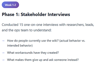
Before I could jump in, I needed to understand how researchers actually used the wiki by recruiting five researchers with varying tenure at Adobe, ranging from three months to seven years. My interviews focused on mapping their actual behaviors—how they search for information, what tools they rely on when the wiki fails them, and where the wiki fits (or doesn't) in their daily work.
What did I ask them?
-
How does the wiki fit into your workflow?
-
When you need to find something, where do you look first?
-
If you could change three things about it, what would they be?
What I thought I knew (and what I actually learned)
I had started this project with three working assumptions about what was broken. The interviews quickly set me straight:
Assumption #1: Researchers would prioritize speed over comprehensiveness
Validated: True. People didn't want to wade through comprehensive guides—they wanted answers, fast.
Assumption #2: The search function was the main problem
Validated: False. Search actually worked fine. The real issues were navigation architecture and inconsistent labeling that made pages impossible to find even when you knew they existed.
Assumption #3: People wanted more structure, not less
Validated: True, but with caveats. Researchers craved structure, but only if it didn't create more work for them. The structure had to be intuitive enough that it felt like less effort, not more.
Research & Discovery
Week 1 - 4: I started by understanding the real pain points, not just the obvious ones.


Design Process & Iterations
While the specifics of my work are under NDA, I can share the thinking, process, and key decisions that shaped the redesign!
Iteration 1: The "Clean Slate" Approach
(Week 4-5)
My first instinct was to completely redesign the IA from scratch based on the card sorting results.
What I designed:
-
Stage-based navigation (Plan → Recruit → Conduct → Analyze → Share)
-
Resource type categorization within each stage
-
Streamlined homepage with quick-access tiles
-
Replace all jargon with action-oriented, plain language labels
What I learned from Testing:


What I took to the next iteration:
Testing validated plain language worked, but I couldn't just rename everything.
I needed to balance clarity with familiarity. My refined approach: keep action-oriented labels but preserve recognizable terms where needed, and expand descriptions since users relied on them heavily.
Iteration 2: The "Hybrid" Model
(Week 5-8)
Back to the drawing board, but this time with data about what worked!
I pivoted to a hybrid approach: instead of forcing one path, offer multiple entry points and let users choose.
What I designed:
-
Dual navigation: stage-based AND resource-based pathways
-
Preserved familiar section names but reorganized contents
-
Contextual cross-linking with "You might also need..." guidance
-
Tiered IA: essential resources at level 1, detailed docs at levels 2-3
And I developed a content structure that worked across both navigation pathways:

What I learned from Testing:


What I took to the next iteration:
Instead of forcing a single path, I wanted to continue designing for different entry points while reducing decision fatigue. Shifting my focus from organizing content to helping researchers land exactly where they needed, faster.
Iteration 3: From Insight to Final Design
(Week 9-10)
By this point, I’d learned that the best solution was one that flexed to meet people where they were, so I carried that mindset into the final iteration.
What I refined:
-
Three-tier content hierarchy that balanced discoverability with depth
-
Progressive disclosure: Show essential info first such as most-accessed resources, recent updates, and role-based quick links, with clear paths to deeper content
-
Scannable page structures: Standardized templates with clear headers, bulleted key info, and expandable details
-
Contextual cross-linking: "If you're here for X, you might also need Y" guidance embedded throughout
Implementation & Results
In the final two weeks, I focused on validating whether the design actually helped researchers move faster and with more confidence.
What I tested:
-
Ran task-based usability tests with 8 researchers using interactive prototypes in Maze
-
Measured: time-to-find, success rate, satisfaction scores, and qualitative feedback
-
Iterated on microcopy and navigation labels based on confusion patterns
What the metrics showed:
✓ Average time-to-find dropped from 15–20 minutes to under 3 minutes
✓ Task success rate: 92% for new researchers, 100% for experienced researchers
✓ Satisfaction scores increased from 4.2/10 to 8.7/10
✓ 100% said they would recommend the structure to a colleague
The Business Outcome
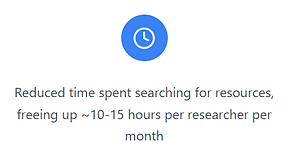
The redesign basically turned the wiki into something people could actually use on their own with minimal hand holding. Researchers went from wasting 10-15 hours a month hunting for stuff to finding what they needed quickly. Support tickets to the Ops team dropped off, so the same team could handle more without hiring anyone new. People got more comfortable using it themselves, onboarded faster, and could actually find what they needed. The result was better knowledge sharing across teams and a system that could scale without falling apart as the org continues to grow!


Internal user outcomes:
✓ Increased confidence navigating the wiki independently
✓ Better knowledge sharing across teams (people could actually find past research)
✓ Reduced frustration and cognitive load during high-pressure project phases
✓ New team members felt less overwhelmed and more welcomed
Reflection
Test early, test often, and test the right things
I used to think if the structure made sense to me, it would work for users. Testing proved me wrong, fast. It showed me how valuable it is to watch people interact with the actual thing and not just whether they can complete tasks, but whether they understand the labels, find the content helpful, and can predict where things live.
The Figma-to-Product Gap
This was my first real taste of the gap between "looks good in Figma" and "works in the actual product." I assumed my designs would just work once I started building them. They didn't. Actually implementing them taught me to think about constraints upfront, design with the researcher in mind, adapt when things need to change.
Clear communication drives trust and momentum.
Being the only intern handling this project taught me how to bring people along for the ride. I couldn't assume anyone knew what I was doing or why. Over-communicating became my default: regular check-ins, documenting everything, and showing iterations even when they weren't polished. It helped me build credibility fast and course-correct before investing too much in the wrong direction.