
Redesigning the CaterPal's Ordering Experience
Redesigned Caterpal’s ordering experience to make catering more seamless, scalable, and efficient for small and mid-sized restaurants and their customers.
My Role:
UX Designer
Project Manager
My Team:
4 UX Designers
Timeline:
April 1st - April 28th
Skills:
UX Research & Testing, Information Architecture, UX Content Strategy, Stakeholder Communication, Usability Testing, Data Analysis
Tools:
Sketch, Figma,
The Business Problem
CaterPal’s catering platform was losing customers due to friction in its ordering workflow and struggled to stand out against established competitors like ezCater and Forkable. Planning managers and office coordinators often spent 30+ minutes on a single catering order, navigating portion sizing, dietary filters, and budget confirmation. This friction led many to abandon routine or last-minute orders altogether.
I conducted a focused UX audit and delivered a rapid redesign that removed unnecessary steps, restructured portioning and dietary filtering, and prioritized ingredient transparency and visual clarity throughout the experience.
The result: a faster, more intuitive ordering flow that makes catering effortless and positions CaterPal as a compelling alternative for both routine and time-sensitive orders.
Clarity through a UX audit...
Cater Pal was hard to navigate and hard to scale. I conducted a Heuristic Evaluation to uncover pain points through the end-to-end ordering experience, and unpack where users were getting slowed down or overwhelmed when placing a order.
Heuristic Evaluation
The evaluation revealed that while CaterPal supported core functionality, the experience lacked the guidance and confidence users needed to move quickly through decisions.


Key findings included:


Competitive and Feature Analysis
I compared CaterPal against leading catering platforms using the feature and competitive business analysis method to identify the biggest area of opportunity for the redesign plan.
Key findings included:


How might we ensure all dietary restrictions and preferences are properly captured?

How might we provide better guidance throughout the catering planning process?
How might we help users visualize what they’re ordering before making a decision?
From insights to strategy
The analysis clarified where key design opportunities existed from a business and competitive standpoint. However, we still had open questions about how users actually experienced the platform. To close this gap, we conducted stakeholder interviews, affinity-mapped our findings, and created personas to ground the redesign in real behaviors, goals, and constraints.


A Smoother, More Visual Ordering Experience
Competitive and Feature Analysis
I compared CaterPal against leading catering platforms using the feature and competitive business analysis method to identify the biggest area of opportunity for the redesign plan.
Implementation & Results
In the final two weeks, I focused on validating whether the design actually helped researchers move faster and with more confidence.
What I tested:
-
Ran task-based usability tests with 8 researchers using interactive prototypes in Maze
-
Measured: time-to-find, success rate, satisfaction scores, and qualitative feedback
-
Iterated on microcopy and navigation labels based on confusion patterns
What the metrics showed:
✓ Average time-to-find dropped from 15–20 minutes to under 3 minutes
✓ Task success rate: 92% for new researchers, 100% for experienced researchers
✓ Satisfaction scores increased from 4.2/10 to 8.7/10
✓ 100% said they would recommend the structure to a colleague
The Business Outcome
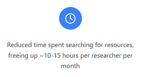
The redesign basically turned the wiki into something people could actually use on their own with minimal hand holding. Researchers went from wasting 10-15 hours a month hunting for stuff to finding what they needed quickly. Support tickets to the Ops team dropped off, so the same team could handle more without hiring anyone new. People got more comfortable using it themselves, onboarded faster, and could actually find what they needed. The result was better knowledge sharing across teams and a system that could scale without falling apart as the org continues to grow!


Internal user outcomes:
✓ Increased confidence navigating the wiki independently
✓ Better knowledge sharing across teams (people could actually find past research)
✓ Reduced frustration and cognitive load during high-pressure project phases
✓ New team members felt less overwhelmed and more welcomed
Reflection
Test early, test often, and test the right things
I used to think if the structure made sense to me, it would work for users. Testing proved me wrong, fast. It showed me how valuable it is to watch people interact with the actual thing and not just whether they can complete tasks, but whether they understand the labels, find the content helpful, and can predict where things live.
The Figma-to-Product Gap
This was my first real taste of the gap between "looks good in Figma" and "works in the actual product." I assumed my designs would just work once I started building them. They didn't. Actually implementing them taught me to think about constraints upfront, design with the researcher in mind, adapt when things need to change.
Clear communication drives trust and momentum.
Being the only intern handling this project taught me how to bring people along for the ride. I couldn't assume anyone knew what I was doing or why. Over-communicating became my default: regular check-ins, documenting everything, and showing iterations even when they weren't polished. It helped me build credibility fast and course-correct before investing too much in the wrong direction.